Wireframes & Prototypes - What's The Difference?
A common misconception we see in the design space is the confusion between wireframes and prototypes. Businesses tend to understand that both are an integral aspect of the design process, but not how they differ in form and functionality.
Prototypes and wireframes are essential as they help designers and developers understand the functionality of their products. They're also useful for determining what content is needed to be included in the product.
While the main difference between the two comes down to how closely a mockup resembles the final product, there are a few key differences when it comes to wireframes and prototypes.
So what exactly is the difference?
Put simply, wireframes consist of a basic layout with structural guidelines of your intended product's layout, whereas prototypes are an advanced wireframe with more visual detail and interaction.
Wireframes
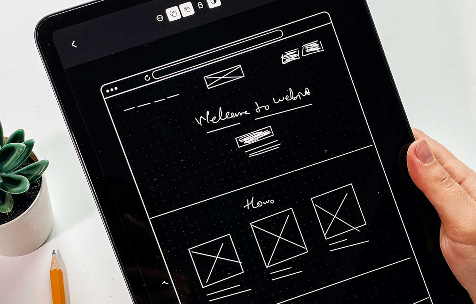
Wireframes are a general two-dimensional illustration of a pages interface that focuses on space allocation and prioritises the location of content, functionalities and intended behaviours. For these reasons, wireframes typically do not include any styling, colours or graphics and are used to provide a blueprint for designers to work from.
Think of your product as a human body, both wireframes and prototypes serve similar but distinct purposes to ensure everything is running smoothly. Wireframes act as the skeleton for your digital product and provide a general idea of how it will be constructed.
Wireframes act as a blueprint for all future development on that product and can be used to show clients what their digital product will look like before anything has been developed.
Prototypes
Prototypes on the other hand are the visual representation of your product demonstrating how the wireframes will look.
Prototypes and wireframes are the backbone of any successful digital product. Prototypes are interactive representations of what the final product will look like, while wireframes are a visual representation of how the screens will be laid out.

Prototypes are more interactive and allow users to engage with the design before it's been built. It's not the final version, but it's a way to show others and enable designers to make tweaks before sending it over to developers for build.
It’s crucial to have content and copy for your design before you start working on a prototype or wireframe because it helps you get an idea about what information needs to be displayed on each screen or page, as well as how it should be communicated.
Tools to use
When it comes to building, there are applications out there to simplify the process so designers can understand the flow before it's been built.
Wireframing:
Pen and paper are easy ways to get started with wireframes as sketching is the fastest way to get ideas from your brain into the world so that you can review, reflect and revise on your ideas.
When it comes to making these ideas digital, we like to use the online application MockFlow which allows us to design the fundamentals of the product and send off to our clients for review.
Prototyping:
Paper prototypes are often used for quick design feedback or for user testing on a small group of people.
For creating digital prototypes, our preferred application is Adobe XD which offers an all in one solution for building out all kinds of software!


